TheFunPass: Where Web3 Meets Everyday Fun
TheFunPass: Where Web3 Meets Everyday Fun
TheFunPass: Where Web3
Meets Everyday Fun
Turning a blockchain product into a friendly, festival-ready experience
Turning a blockchain product into a friendly, festival-ready experience
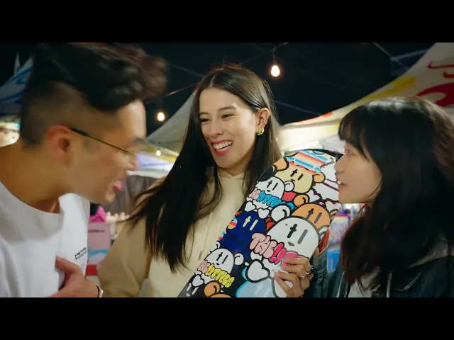
The Richmond Night Market brings over a million visitors each year—fast-moving, spontaneous, and focused on having fun. Introducing a Web3-powered loyalty app in this environment wasn’t straightforward. Most people aren’t interested in learning new concepts while navigating food stalls, games, and crowds.
The Richmond Night Market brings over a million visitors each year—fast-moving, spontaneous, and focused on having fun. Introducing a Web3-powered loyalty app in this environment wasn’t straightforward. Most people aren’t interested in learning new concepts while navigating food stalls, games, and crowds.
For TheFunPass to work, the experience needed to feel familiar and effortless, with the blockchain layer operating quietly in the background.
For TheFunPass to work, the experience needed to feel familiar and effortless, with the blockchain layer operating quietly in the background.
My Role
I’m responsible for the App’s UI/visual work: defining the visual direction, simplifying interaction flows, and converting brand illustrations into a cohesive UI system. I also designed custom illustrations and collectible badges, worked with founders and developers to refined interactions so the Web3 layer felt invisible to users.
Hypotheses
Hypotheses
We grounded the work in a few assumptions shaped by how people behave in high‑energy environments:
We grounded the work in a few assumptions shaped by how people behave in high‑energy environments:
Clear visuals and simple cues work better than written explanations.
Visitors won’t slow down to understand new concepts or technologies.
If an interaction feels intuitive, people will use it—even if it’s powered by Web3.
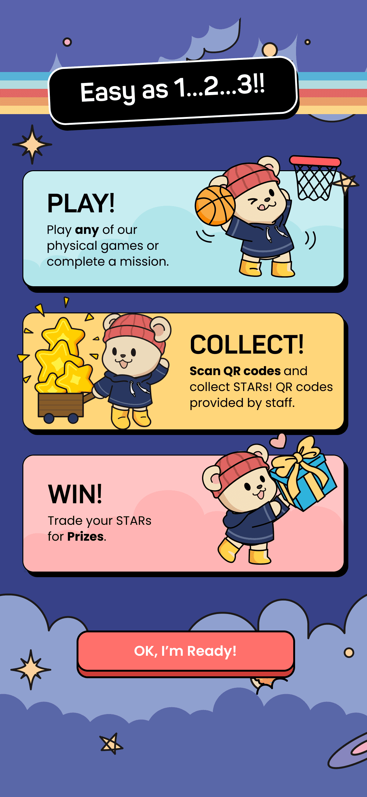
Instead of waiting for certainty, I used design to make the regulation tangible, turning vague text into visual workflows the whole team could align on. So, what did I do?
The hypotheses became the foundation for the design approach:
The hypotheses became the foundation for the design approach:
01
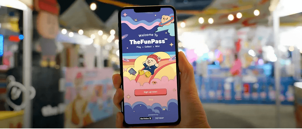
Making Web3 Invisible
The design needed to match the pace of the night market: quick, clear, and easy to act on.
The focus was on removing unnecessary friction and letting users move through the app without thinking about what was happening behind the scenes.
01
Making Web3 Invisible
The design needed to match the pace of the night market: quick, clear, and easy to act on.
The focus was on removing unnecessary friction and letting users move through the app without thinking about what was happening behind the scenes.
02
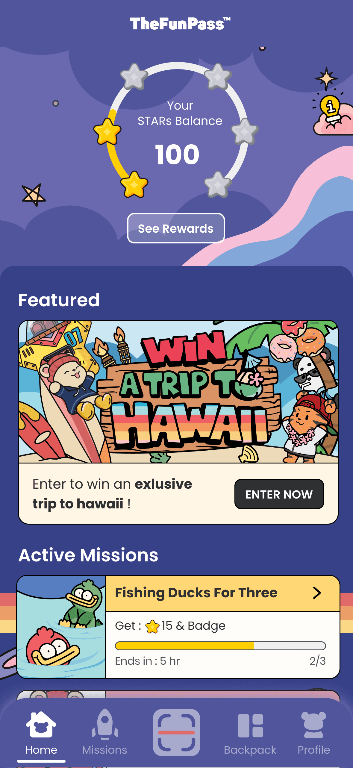
Designing Clear, Low-Friction Interactions
Onboarding, earning points, and redeeming rewards were reduced to the essentials.
Prompts were clear, steps were minimal, and each action provided instant feedback so users could continue enjoying the event without interruption.
02
Designing Clear, Low-Friction Interactions
Onboarding, earning points, and redeeming rewards were reduced to the essentials.
Prompts were clear, steps were minimal, and each action provided instant feedback so users could continue enjoying the event without interruption.
03
Extending the Brand Into a UI System
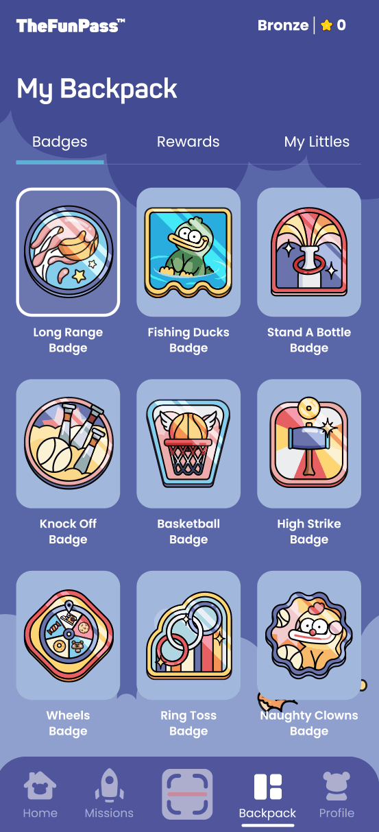
Illustrations, badges, and color elements were designed to feel playful while still carrying functional weight. They highlighted progress, clarified states, and made the interface easy to understand at a glance—helping the system feel welcoming instead of technical.
03
Extending the Brand Into a UI System
Illustrations, badges, and color elements were designed to feel playful while still carrying functional weight. They highlighted progress, clarified states, and made the interface easy to understand at a glance—helping the system feel welcoming instead of technical.
Design Hilights
Design Hilights
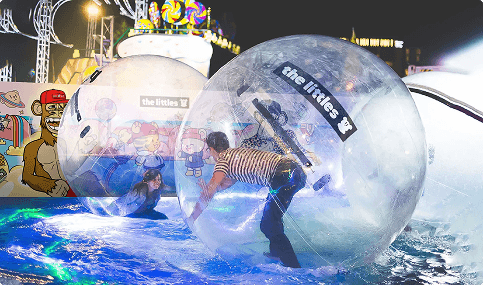
These highlights show how the experience came together in practice—from core flows to visual details—and how it translated into a live, in-person launch at the night market.
These highlights show how the experience came together in practice—from core flows to visual details—and how it translated into a live, in-person launch at the night market.
The Outcome
The Outcome
TheFunPass launch delivered clear traction : participating vendors reported a 12.5% increase in revenue, supported by healthy scan rates, opt-in percentages, and repeat-visit intent.
TheFunPass launch delivered clear traction : participating vendors reported a 12.5% increase in revenue, supported by healthy scan rates, opt-in percentages, and repeat-visit intent.
The experience felt natural in the festival environment, making Web3 interactions feel familiar and easy. This validated that the design direction worked—not just for a blockchain audience, but for casual, in-person use at scale.
Instead of waiting for certainty, I used design to make the regulation tangible, turning vague text into visual workflows the whole team could align on. So, what did I do?
elva
retta
elva
retta